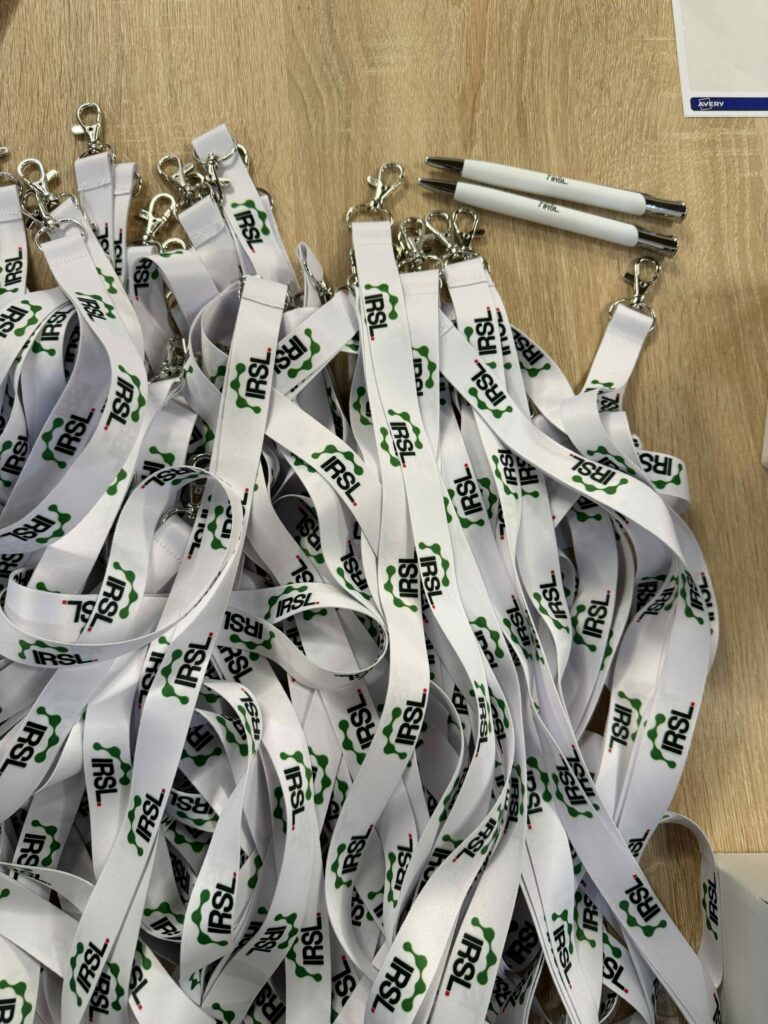
A new logo for the IRSL!
Rebranding
This logo, designed in collaboration with the communications agency Le Plus du Web, recalls the Institute’s history through the use of the green colour associated with the former Institute of Haematology or the “drop” symbol of the IRSL. The green colour also sets it apart from the logos of other research centres in the Île-de-France region. The emblem symbolises the various buildings that make up the IRSL, the bridge over the Canal Saint-Martin, cells or a multilobed nucleus, and an oak leaf from Saint-Louis; the red square symbolises the famous square courtyard of Saint-Louis Hospital.